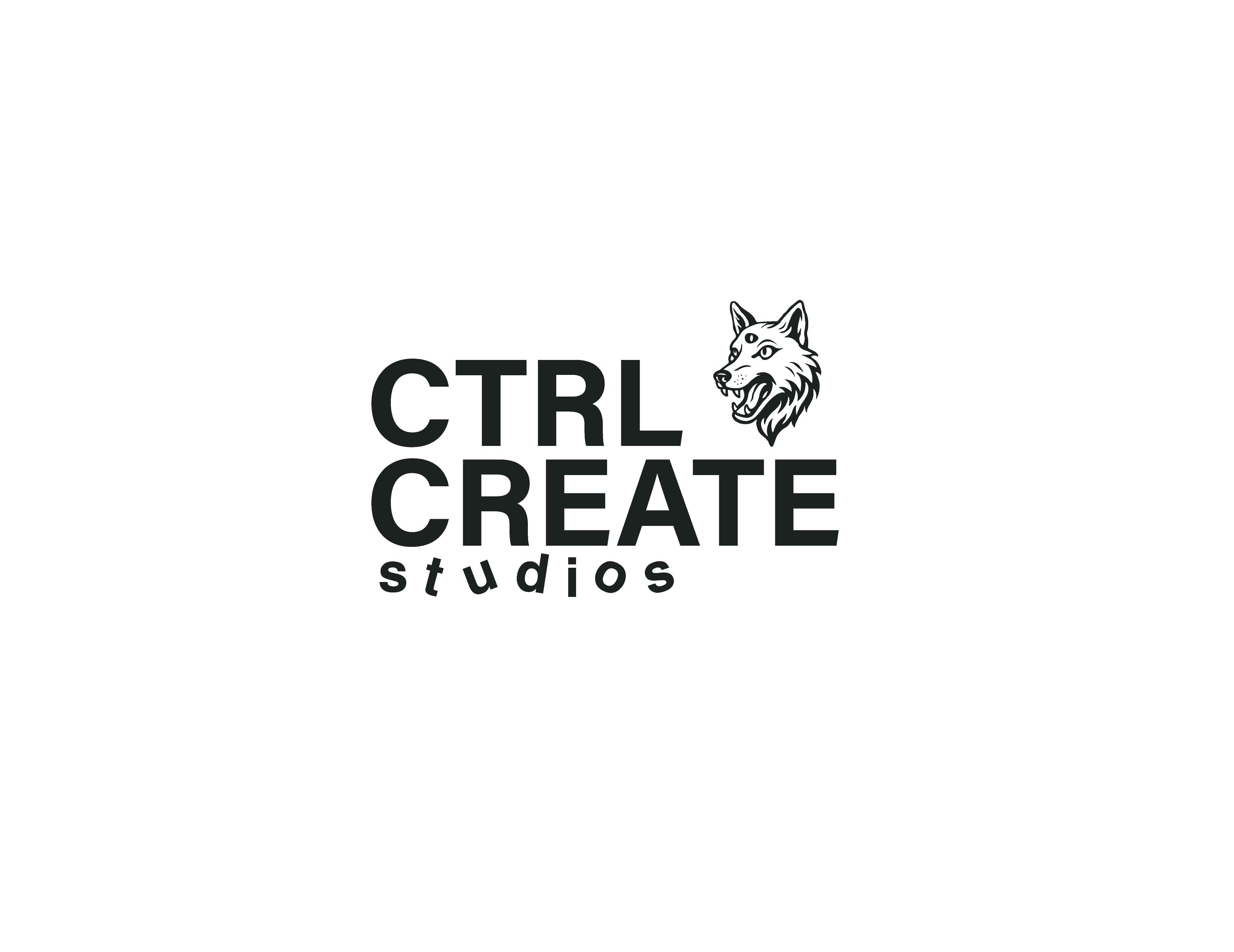
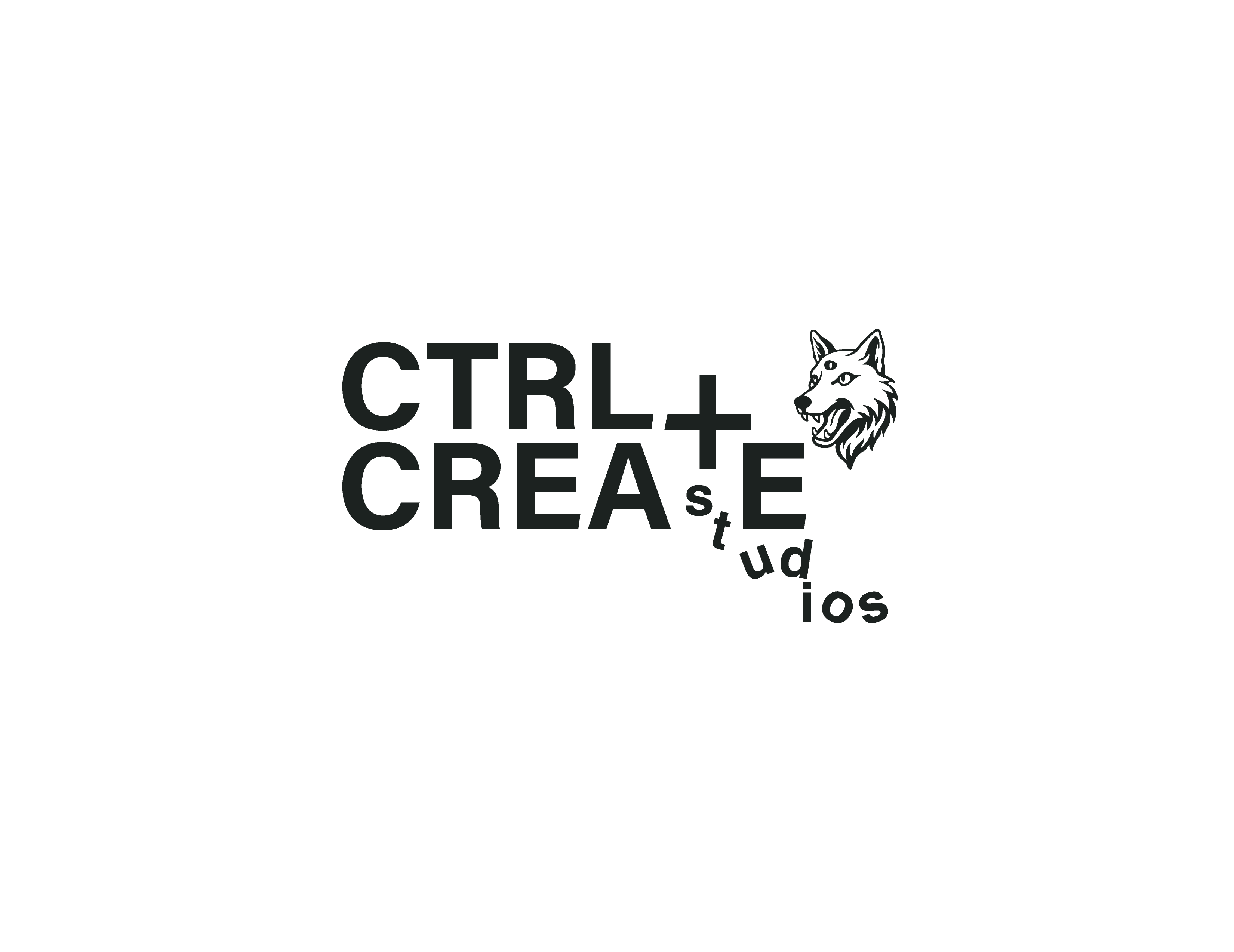
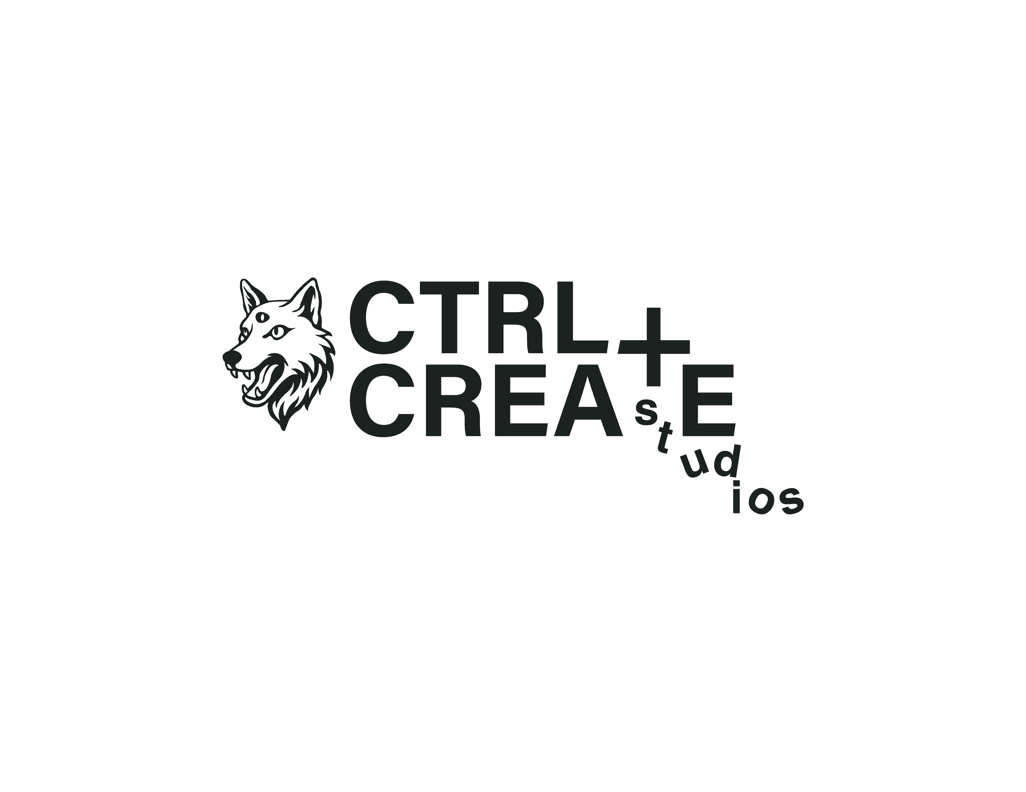
I identified a disconnect between its visual language and the organization's goals. CCS serves as an educational space for young creatives but the existing logo lacked the energy and cultural relevance with it's demographic. I evolved the logo to feel expressive yet educational while preserving elements of its originality.
The final direction introduced movement and boldness without sacrificing clarity.
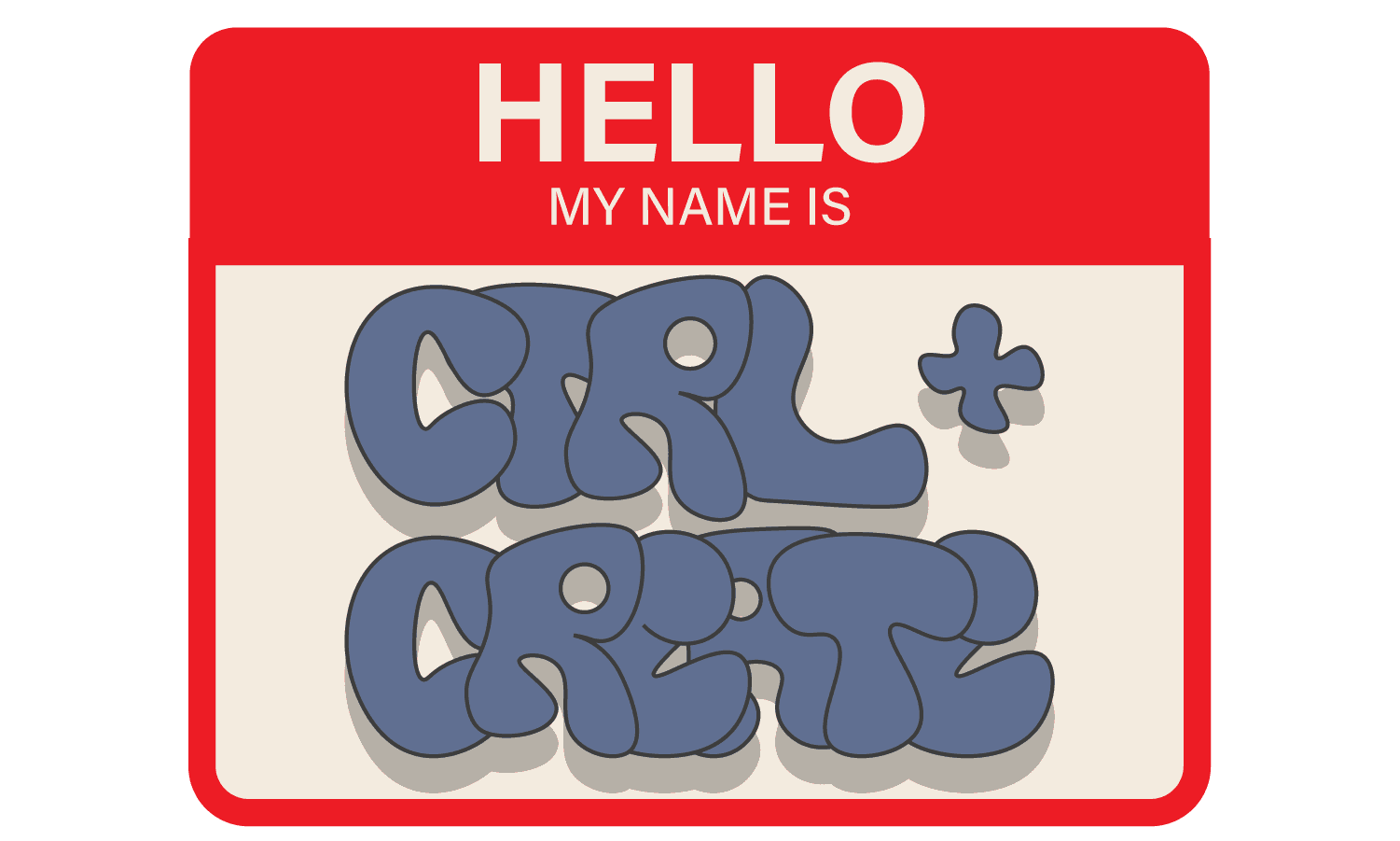
In support of the evolving logo, I created a complementary wordmark that reinforces structure and familiarity. The typographic direction introduces suitable creative variation while maintaining cohesion and consistency.
DELIVERABLES
LOGOS, TYPE, PALETTE, ASSETS
CTRL + CREATE STUDIO
I led the studio's brand case study, reshaping its original identity to resonate with the youth audience it serves while supporting its mission in art, animation, and design.
This began with transforming the original logo.
I identified a disconnect between its visual language and the organization's goals. CCS serves as an educational space for young creatives but the existing logo lacked the energy and cultural relevance with it's demographic. I evolved the logo to feel expressive yet educational while preserving elements of its original identity.
The final direction introduced movement and boldness without sacrificing clarity.
In support of the evolving logo, I created a complementary wordmark that reinforces structure and familiarity. The typographic direction introduces suitable creative variation while maintaining cohesion and consistency.
The color direction leans into a mix of pastel and flat tones, creating a subtle yet expressive visual language. After exploring several alternatives, the team and I aligned on this palette as the strongest reflection of the studio's mission and audience.
A single type family was used to create a legible and scalable typographic system. Weight variation establishes clear hierarchy while maintaining visual consistency across digital and print materials.
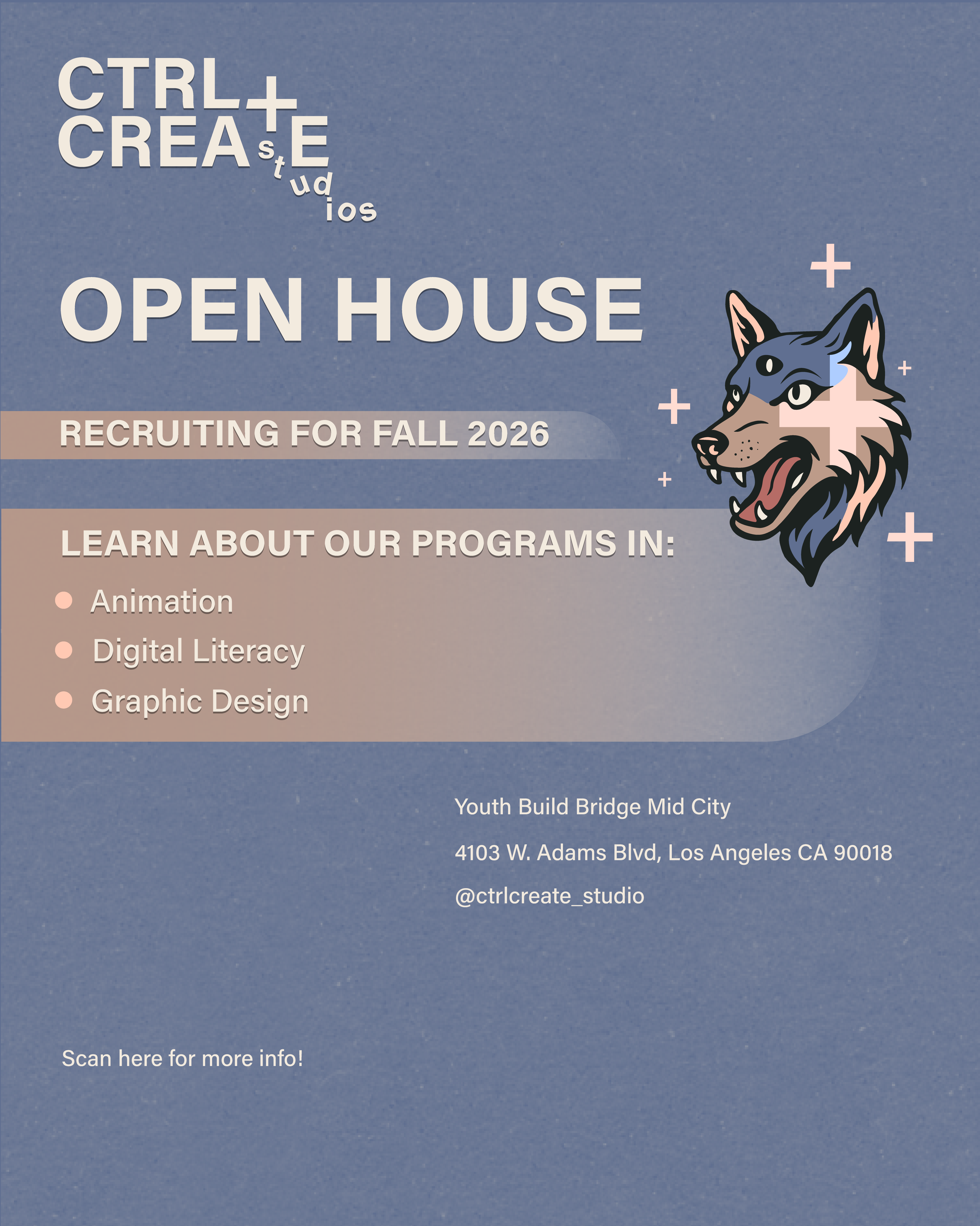
The refined ecosystem has been applied across Instagram, Youtube, website, social media posts, videos, and event fliers.
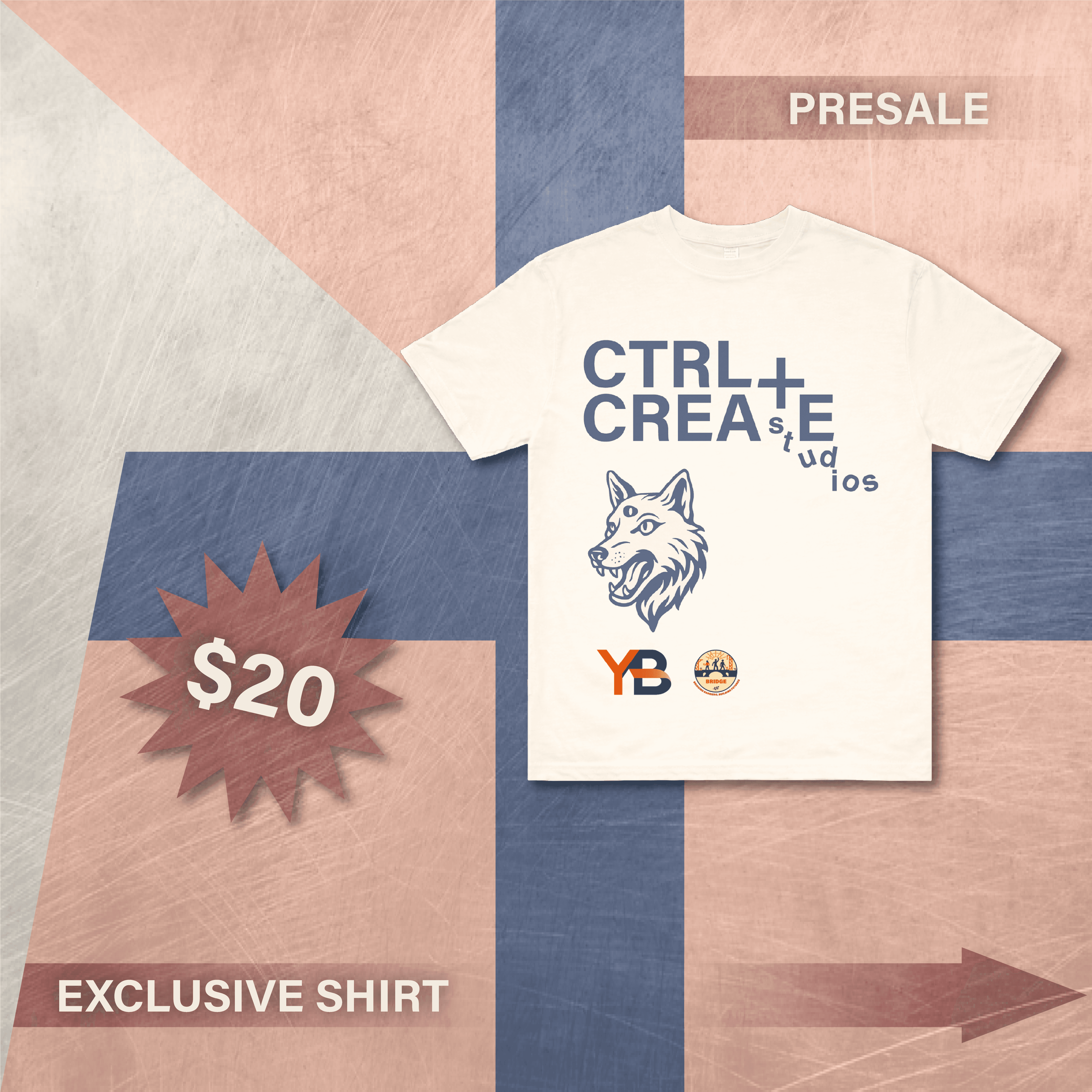
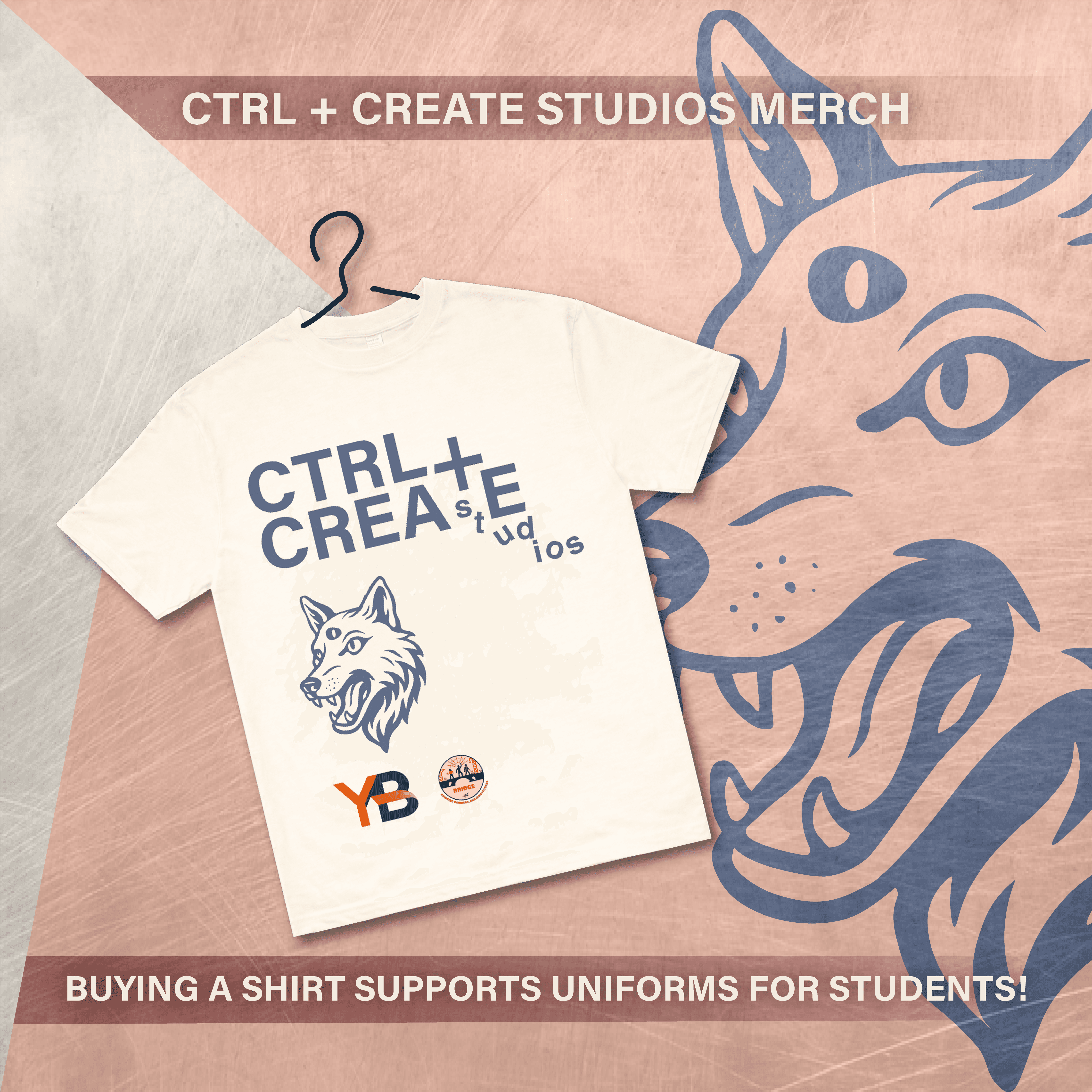
For the studio's Art Festival, themed Mental Health + Culture, we extended the developed brand system into a wearable format. The headline "Where the Culture Meets the Mind" reflects the intersection of heritage and mental wellness.
THANKS, BYE!
I've had a blast working with the studio. Shout out to the team.
CTRL + CREATE STUDIO
I led the studio's brand case study, reshaping its original identity to resonate with the youth audience it serves while supporting its mission in art, animation, and design.
This began with transforming the original logo.
DELIVERABLES
LOGOS, TYPE, PALETTE, ASSETS
I identified a disconnect between its visual language and the organization's goals. CCS serves as an educational space for young creatives but the existing logo lacked the energy and cultural relevance with it's demographic. I evolved the logo to feel expressive yet educational while preserving elements of its original identity.
The final direction introduced movement and boldness without sacrificing clarity or recognition.
In support of the evolving logo, I created a complementary wordmark that reinforces structure and familiarity. The typographic direction introduces suitable creative variation while maintaining cohesion and consistency.
The color direction leans into a mix of pastel and flat tones, creating a subtle yet expressive visual language. After exploring several alternatives, the team and I aligned on this palette as the strongest reflection of the studio's mission and audience.
A single type family was used to create a legible and scalable typographic system. Weight variation establishes clear hierarchy while maintaining visual consistency across digital and print materials.
The refined ecosystem has been applied across Instagram, Youtube, website, social media posts, videos, and event fliers.
For the studio's Art Festival, themed Mental Health + Culture, we extended the developed brand system into a wearable format. The headline "Where the Culture Meets the Mind" reflects the intersection of heritage and mental wellness.
THANKS, BYE!
I've had a blast working with the studio. Shout out to the team.
CTRL + CREATE STUDIO
I led the studio's brand case study, reshaping its original identity to resonate with the youth audience it serves while supporting its mission in art, animation, and design.
This began with transforming the original logo.
The color direction leans into a mix of pastel and flat tones, creating a subtle yet expressive visual language. After exploring several alternatives, the team and I aligned on this palette as the strongest reflection of the studio's mission and audience.
A single type family was used to create a legible and scalable typographic system. Weight variation establishes clear hierarchy while maintaining visual consistency across digital and print materials.